

CLIENT: UMFS
Founded as an orphanage 112 years ago, UMFS has grown into a multi-dimensional social service agency with 10 offices throughout Virginia providing a spectrum of services for children. While a branding effort several years ago helped United Methodist Family Service change its name to UMFS and adopt a new logo, the agency needed more help to raise its profile in the state. They engaged Red Rooster Group for strategic branding guidance to develop a unified voice and visual look with a clear, purposeful message, vibrancy and consistency in marketing materials, and employees that serve as enthusiastic brand ambassadors for UMFS.
Goals
As with all our engagements, we start by looking at the organization’s strategic goals.
- Having a clear set of messages and an organizational culture where every employee believes and lives the message of the organization.
- Increase number of donors and obtain $1.5 million in donations from donors, foundations and grants.
- Increase market share for statewide referrals.
- Increase media visibility for UMFS around the state.
Market Research
We began the process with the following market research:
- 15 in-depth hour-long Interviews with staff, donors and other constituents.
- Competitive Landscape Review of social service agencies in Virginia.
- Marketing Materials Review assessing the organization’s brochures, ads, newsletters and other communications.
Messaging
Mission Statement & Tagline
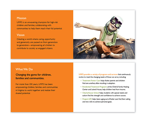
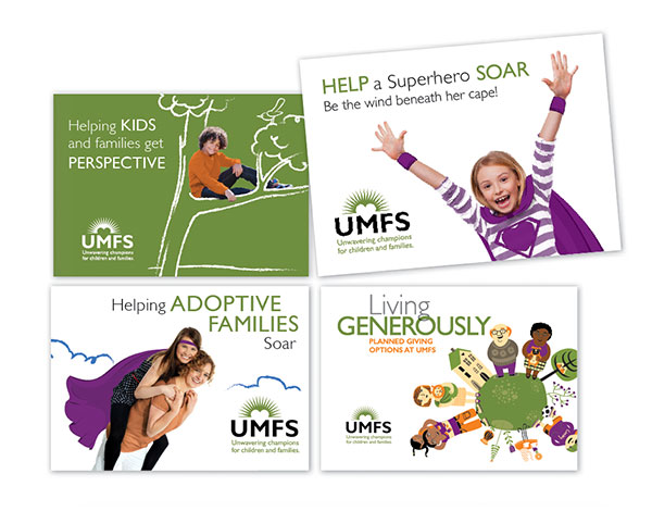
After conducting research about the needs and perceptions of the organization, and a review of the organization’s materials, we recommended revisiting their mission, vision, tagline and core messaging. Working with a committee of 10 people including key staff, board, and lay people, we prescribed a series of sessions to get to the heart of what UMFS is all about, and to craft a Mission Statement that would serve the organization well. Presenting Mission and Vision Statements definition and role, as well as sample Mission and Vision Statements from other nonprofit organizations, we led the committee through several lively discussions ultimately leading to the theme of ”Unwavering champions for children and families,” which serves as their tagline.
Other Messaging
After the Mission Statement was nailed down, we developed their Vision Statement, and then a full range of messaging including:
- What We Do
- Internal and External Message Points
- Description of Services
- Elevator Pitch
- Short, Medium and Long Boilerplate Language
- Fundraising Language
Because of UMFS’ strong ties to the Methodist community, we also developed messaging points describing the need to move beyond the faith-based community while not disenfranchising them.
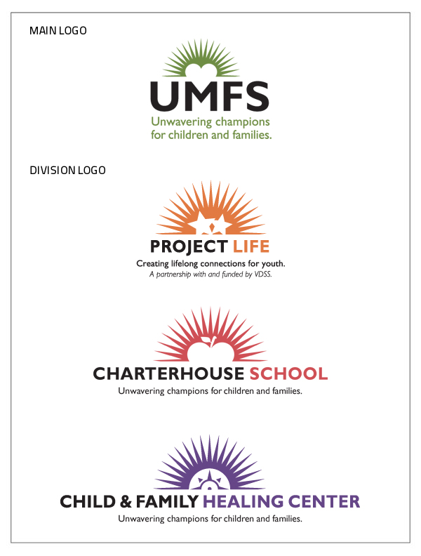
Main Logo & Tagline, and Division Logos
UMFS had introduced a new logo several years ago, along with logos for their divisions. While the UMFS logo cleanly displayed a symbol of a heart to represent the agency, the division logos resorted to more literal, and cliché renderings. We took on the task of developing icons that communicated their respective messages. For Project Life, whose mission is to empower young adults who have aged out of foster care system, we used 2 stars to represent the youth and the support behind them. For Child & Family Healing Center, we used a compass to symbolize how the program helps point people in the right direction in their lives — a fitting symbols since program participants are handed a compass at the completion of the program.
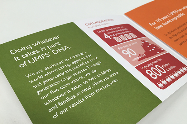
Brochures
The brochures present a fresh new look for the organization that reinforces their theme of ”Unwavering champions for children and families,” and introduces the elements of play and creativity that drive the UMFS’ work with children. The new look is inviting to read and helps UMFS stand out from other social service agencies in the state.
Newsletter
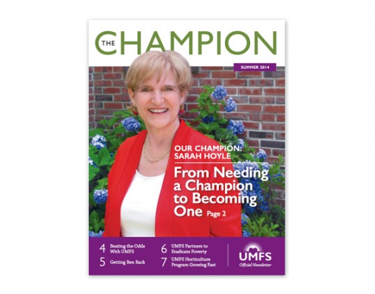
In line with their new messaging, we renamed their Guardian Newsletter, The Champion and oriented it around showcasing people who are living the organization’s mission. Red Rooster Group handled the complete writing and design services.
Website
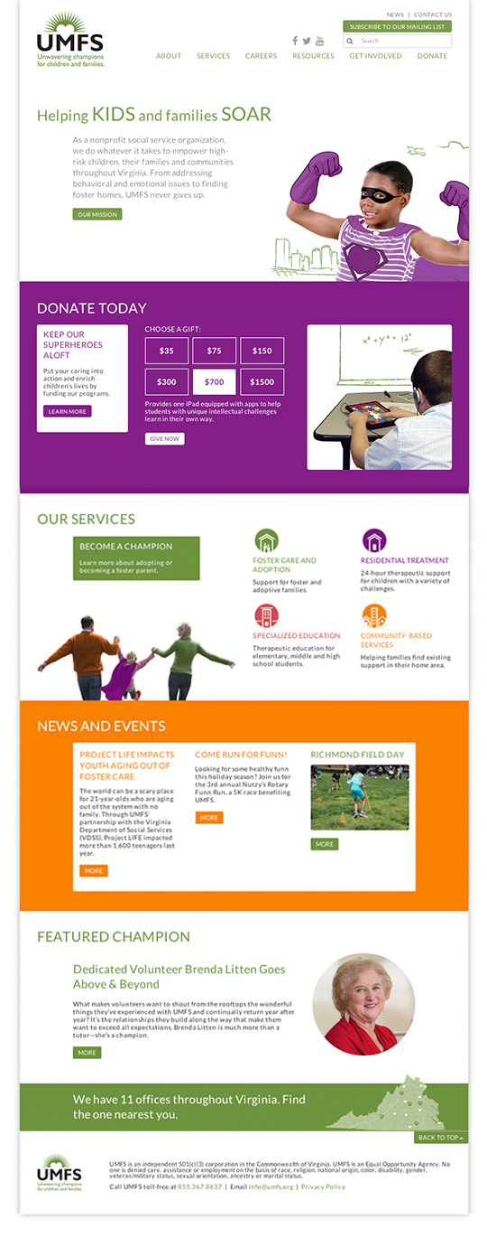
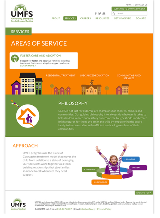
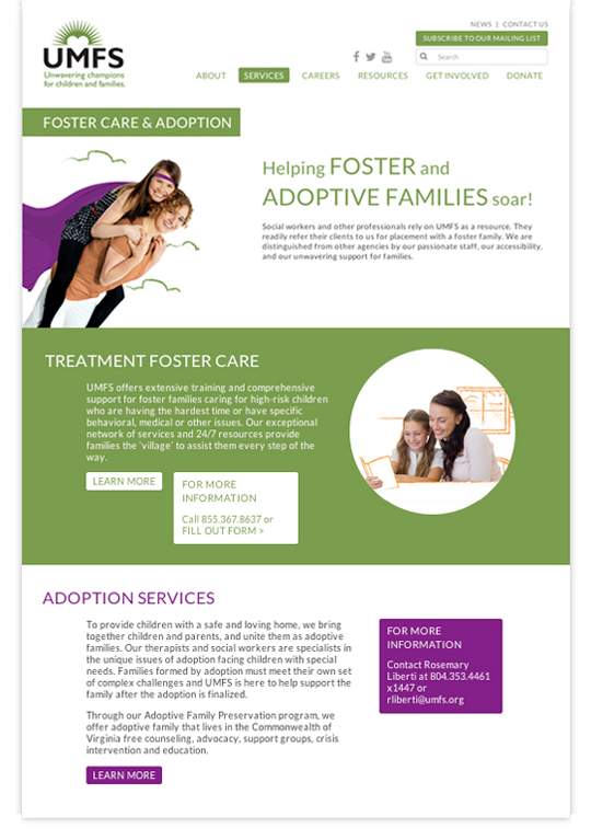
We developed a responsive website for this social service agency that showcases the organization’s new brand image and language and presents its services is a compelling way. The website was developed in WordPress around a flexible modular block system that allows for creating interesting pages throughout the site. Interactive features include the Donate Today section with rollover displaying gift descriptions, rollover exploration of Services, and features to engage potential employees, among other features. The site was specifically designed to be fully responsive and adaptable for mobile and tablet devices.
Impact Report
When it came time to communicate the impact the organizations had across a range of areas, we created a brochure that displays infographics of statistics showing the organization’s impact in five areas corresponding to their values. The infographics use large numbers as a focal point, and icon-style graphics to illustrate the points. The graphics were used both in a printed brochure, as well as on their website, which we also created, and are designed to be seen on a mobile device.
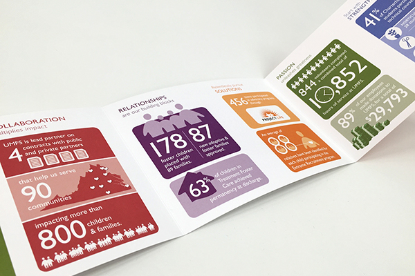
> See the graphics on the responsive web page.
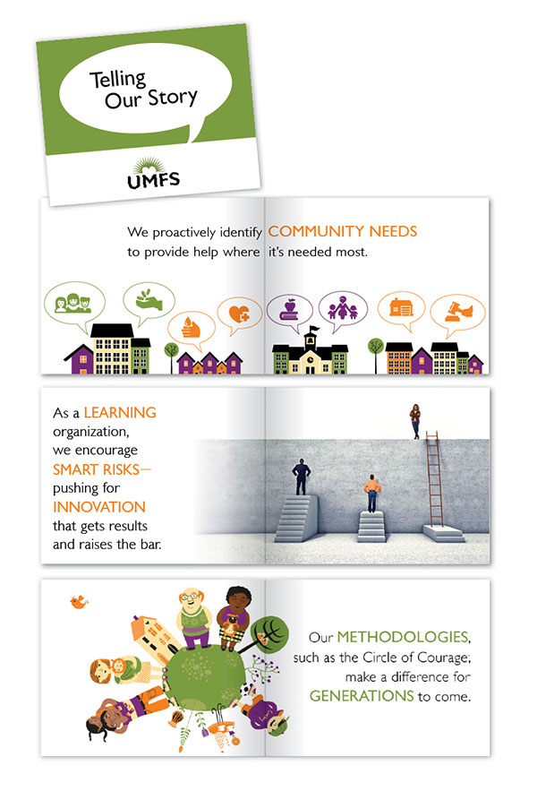
Brand Book
To help UMFS communicate its message to its 300 employees statewide, we created a brand book to illustrate the key points in an easy-to-understand way. Copies of the brand book were distributed at brand launch sessions to build enthusiasm and facilitate consistent messaging throughout the organization.
Brand Launches Sessions
To help staff understand and embrace the brand messages, we held brand workshops for key staff and for the board. The sessions included hands-on activities to foster adoption of the messages. One participant said, ”Five years ago, we had another agency do our branding, and do a workshop, but this was much better. First, you guys really nailed what we are all about. And second, I really feel that I understand and embrace our messages.”
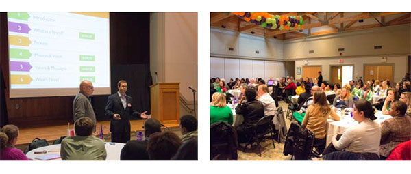
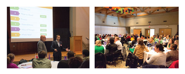
Left: Howard and Jonathan lead the session and explain what is to come.
Right: About 80 key staff attended the workshop. We held a separate session for the board.
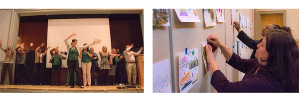
Left: For one activity, we asked participants to write and perform a song using UMFS’s new messages. Amazing us, everyone in the room got up and performed what they had written.
Right: We also asked participants to decorate a sheet showing the wall surrounding their campus to demonstrate to outsiders what’s behind the wall. Decorated sheets are posted on a wall for all to view and were then posted on their intranet to galvanize support among staff.
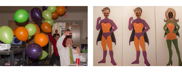
Left: A balloon drop, to the music of “We are the Champions” helped generate excitement and underscore the message and importance of the brand initiative.
Right: To drive home the message of ”Unwavering Champions,” we created champion cutouts for people to take their pictures in.
Results
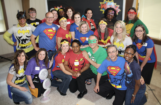
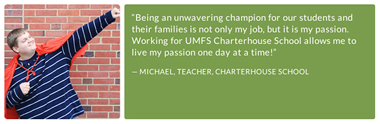
The organization is fully embracing its new theme. Staff took it upon themselves to dress as superheroes, exuding their gusto for their role as champions for children, and perhaps making them the coolest social service agency ever.
Links
![]() Red Rooster Group is a New York based graphic design firm that creates effective brands, websites, and marketing campaigns to increase your visibility, fundraising, and communication effectiveness. Contact us at info@redroostergroup.com.
Red Rooster Group is a New York based graphic design firm that creates effective brands, websites, and marketing campaigns to increase your visibility, fundraising, and communication effectiveness. Contact us at info@redroostergroup.com.